807 Components

Webflow Components Library

807+ Webflow native components with 1-click copy & paste. Authentication forms, member areas, payment flows, and more—built for Memberstack integration.

Unstyled Forgot Password - 3
View Component
Forgot PasswordUnstyled

Unstyled Forgot Password - 3

This component provides a simple, unstyled interface for informing users that their password has been reset. Key Features Includes a link back to the login pageDesign Elements: Minimalistic design with no predefined styles Uses standard HTML elements such as forms, headings, and labels Responsive layout suitable for various devices Potential Use Cases: Web applications requiring user authenticationE-commerce platforms needing secure password recovery Membership sites with user accounts Any service that requires user login and password management Conclusion: The Unstyled Forgot Password - 3 component is a versatile and functional solution for password recovery, ideal for developers looking for a straightforward implementation without design constraints.

Unstyled Update Password
View Component
Profile PasswordUnstyled

Unstyled Update Password

The Unstyled Update Password component is designed to facilitate password updates for users through a simple form interface. It includes fields for entering the current and new passwords, along with validation messages. Key Features Form includes fields for current and new passwords Validation message for password length requirements Success and error messages upon form submission Lightweight and unstyled for easy customization Design Elements Minimalistic design with no predefined stylesClear headings and labels for user guidanceResponsive layout suitable for various devices Potential Use Cases Web applications requiring user authentication Membership sites needing secure password updatesE-commerce platforms with user accounts Corporate intranets for employee access management Conclusion: The Unstyled Update Password component is a versatile and straightforward solution for implementing password update functionality, making it ideal for developers looking to customize their user experience.

Unstyled Forgot Password - 2
View Component
Forgot PasswordUnstyled

Unstyled Forgot Password - 2

This component serves as a password reset form, allowing users to enter a 6-digit code and create a new password. It is designed to be functional without any predefined styles. Key Features Form for entering a 6-digit code and new password Success and error messages for user feedback Redirects to a success page upon completion No styling included, allowing for full customization Design Elements Minimalist layout with basic input fieldsClear headings and instructional textResponsive design suitable for various devices Potential Use Cases Web applications requiring user authenticationE-commerce sites needing secure password recovery Membership platforms with user accounts SaaS products that require user login management Conclusion: The Unstyled Forgot Password - 2 component is a versatile and functional solution for password recovery, ideal for developers looking to implement a customizable form without predefined styles.

Unstyled Update Email
View Component
Profile EmailUnstyled

Unstyled Update Email

The Unstyled Update Email component is designed to facilitate users in updating their email addresses through a simple form interface. It includes essential fields and messages for user interaction. Key Features Form for email address updateSuccess and error messagesRequired email input fieldUser-friendly interface Design Elements Minimalistic design with no stylingClear headings and labelsResponsive layout suitable for various devices Potential Use Cases Web applications requiring user email updates Membership sites needing email verificationE-commerce platforms for customer account management Online services with user account functionalities Conclusion: The Unstyled Update Email component is a versatile tool for any web application that requires user email management, offering a straightforward and effective solution without unnecessary design elements.

Unstyled Forgot Password - 1
View Component
Forgot PasswordUnstyled

Unstyled Forgot Password - 1

This component provides a simple and functional forgot password form, allowing users to request password reset instructions via email. Key Features User-friendly email input field Submit button with a loading message Success and error messages for form submission feedback Redirects to a password reset page upon submission Design Elements Minimalist design with no predefined styles Clean layout suitable for integration into various web designs Responsive structure adaptable to different screen sizes Potential Use Cases E-commerce websites needing user account recovery options Membership sites requiring secure password management Blogs or content platforms with user accounts SaaS applications that require user authentication Conclusion: The Unstyled Forgot Password component is a versatile and essential tool for any web application that requires user password recovery, easily customizable to fit various design aesthetics.

Unstyled Login
View Component
LoginUnstyled

Unstyled Login

The Unstyled Login component is a simple and functional login form designed for easy integration into websites. It features essential fields for user authentication without any predefined styling. Key Features Includes fields for email and password input Supports form submission with success and error messages Customizable design to fit various branding needs Responsive layout suitable for different devices Integration with Memberstack for user management Design Elements: Minimalistic layout with no predefined stylesFlexbox structure for responsive designIncludes placeholder text and tooltipsPotential Use Cases: Startups needing a quick login solution Web applications requiring user authenticationE-commerce sites looking for a simple login interface Membership sites utilizing Memberstack for user management Landing pages that require user sign-in functionality Conclusion: The Unstyled Login component offers a versatile and straightforward solution for user authentication, making it ideal for developers looking to implement a login system without the constraints of a specific design.

Formulario de perfil sin estilo
View Component
ProfileUnstyled

Formulario de perfil sin estilo

The Unstyled Profile Form is a simple and functional form designed for users to update their profile information. It includes fields for first name, last name, and phone number, along with success and error messages. Key Features Customizable fields for first name, last name, and phone number Success message upon successful submission Error message for submission failures Lightweight and easy to integrate into existing designs Design Elements Minimalist design with no predefined stylesFlexbox layout for form elementsResponsive design suitable for various screen sizes Potential Use Cases User profile management for web applications Membership sites requiring user information updatesE-commerce platforms for customer account management Community forums for user profile editing Conclusion: The Unstyled Profile Form offers a straightforward solution for user profile updates, making it versatile for various applications while allowing for easy customization to fit different design aesthetics.

Inscripción sin estilo
View Component
SignupUnstyled

Inscripción sin estilo

The Unstyled Signup component is a simple and functional signup form designed for easy integration into any website. It features essential fields for user registration without any predefined styling. Key Features Includes fields for First Name, Email, and Password Form submission button with customizable text Success and error messages for user feedback Lightweight and easy to customize Responsive design suitable for various devices Design Elements Minimalist layout with no predefined stylesFlexbox layout for form alignmentClear and straightforward user interface Potential Use Cases Startups looking for a quick signup solution Blogs or content sites needing user registrationE-commerce platforms requiring customer accounts Event registration pages SaaS applications needing user onboarding Conclusion: The Unstyled Signup component is a versatile and adaptable solution for any website needing a user registration form, allowing for complete customization to fit the brand's style.

Upload File Drag and Drop
View Component
Todos

Upload File Drag and Drop

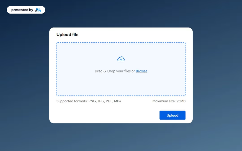
This component provides an elegant and functional interface for users to upload files seamlessly, enhancing both usability and aesthetics. Key Features Drag and drop functionality for easy file uploads Maximum file size limit of 25MBIncludes success and error messages for user feedback Customizable design elements Design Elements: Modern and clean interface Dashed border to indicate upload area Responsive design suitable for various devices Color scheme featuring soft backgrounds and contrasting button colors Potential Use Cases: Web applications requiring user file submissions Educational platforms for assignment uploads Corporate intranets for document sharingE-commerce sites for product file uploads Event registration forms requiring document attachments Conclusion: The Upload File Drag and Drop component is a versatile tool that enhances user experience while maintaining a professional appearance, making it suitable for a wide range of applications.

Trial Form Component
View Component
Todos

Trial Form Component

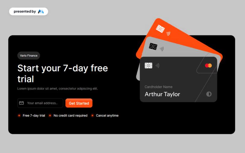
The Trial Form Component allows users to easily sign up for a free trial, enhancing user engagement and lead generation. Key Features User-friendly form for signing up for a free trial Responsive design suitable for various devices Includes success and error messages for form submissions Customizable fields for user input Design Elements: Modern and clean layout Flexible grid and flexbox structures for responsive design Use of icons to enhance visual appeal Color scheme featuring light and dark contrasts Rounded corners and subtle shadows for a polished look Potential Use Cases: SaaS companies offering free trials Educational platforms providing trial access to courses Fitness or wellness apps promoting trial memberships Software tools looking to increase user adoptionE-commerce sites offering trial products or services Conclusion: The Trial Form Component is a versatile tool that can significantly boost user acquisition for businesses across various industries by providing an intuitive and engaging sign-up experience.

Individual Signup
View Component
Regístrese en

Individual Signup

The Individual Signup component is designed to facilitate user registration through a clean and user-friendly interface, incorporating both traditional and social login options. Key Features User-friendly form layout with clear labels Includes fields for name, email, and password Social login options for Google and Facebook Responsive design suitable for various devices Success and error messages for user feedback Design Elements Modern and minimalistic design Color scheme featuring shades of blue and white Rounded input fields and buttons for a softer appearance Use of icons for social login options Potential Use Cases Startups looking to onboard new users quicklyE-commerce platforms requiring user registration SaaS applications needing a streamlined signup process Event management sites for attendee registration Educational platforms for student enrollment Conclusion: The Individual Signup component is a versatile and visually appealing solution for any website needing a registration feature, enhancing user experience and engagement.

Autocomplete Address Form
View Component
Entrada

Autocomplete Address Form

The Autocomplete Address Form is a user-friendly form component designed to streamline the process of entering address details by providing autocomplete suggestions. It enhances user experience by reducing input errors and speeding up form completion. Key Features Includes fields for Address, ZIP Code, City, Region, and Country.Provides success and error messages upon form submission.Responsive design suitable for various devices.Customizable input fields with placeholder options.Live preview available for testing. Design Elements Clean and modern layout with a flexible form structure.Utilizes a light color scheme with subtle borders and shadows.Labels are clearly defined with a margin for better readability.Input fields are styled with rounded corners and focus effects. Potential Use Cases E-commerce websites requiring shipping address collection.Real estate platforms for property inquiries.Event registration forms needing attendee address details.Subscription services that require user address verification.Contact forms for businesses that need location information. Conclusion: The Autocomplete Address Form is a versatile and efficient solution for any website needing address input, enhancing user experience while ensuring accurate data collection.

Sign up with Email modal
View Component
LoginAll+1

Sign up with Email modal

This component provides a user-friendly modal for seamless account creation and login through email, enhancing the authentication process with intuitive forms. Key Features Intuitive email fields for easy sign-up and login Responsive design suitable for various devices Includes options for social sign-up via Google Success and error messages for user feedback Customizable styles and layout Design Elements Minimalistic layout with a clean aesthetic Soft color palette featuring light grey and dark grey tones Centered alignment for a balanced appearance Use of icons for visual appeal and clarity Potential Use Cases Startups looking to streamline user registrationE-commerce platforms needing quick account creation SaaS applications requiring user authentication Blogs or content platforms wanting to build a subscriber base Event management sites for attendee sign-ups Conclusion: The Sign up with Email modal is a versatile and visually appealing component that simplifies user registration and enhances the overall user experience.

Página de confirmación de cierre de sesión
View Component
Desconectado

Página de confirmación de cierre de sesión

The Logged Out Confirmation Page is designed to inform users that they have successfully logged out of their account, providing a friendly message and options to log back in or sign up. Key Features Responsive design suitable for various devices Includes a navigation bar with links to login and dashboard Customizable branding with logo placement Engaging content with a welcoming message Call-to-action buttons for logging back in or signing up Design Elements: Clean and modern layout Use of whitespace for clarity Flexible grid system for responsive design Color scheme that emphasizes user engagement Potential Use Cases: Web applications requiring user authenticationE-commerce sites needing user account management Membership-based platforms for user engagement Blogs or content sites with user login features Corporate websites with user portals Conclusion: The Logged Out Confirmation Page is a versatile component that enhances user experience by providing clear communication and easy navigation options, making it an essential feature for any web application with user accounts.

Increase & Decrease Select Value
View Component
Entrada

Increase & Decrease Select Value

This component allows users to easily increase or decrease a selected value from a dropdown menu using intuitive buttons. It enhances user experience by providing a visual and interactive way to select options. Key Features Interactive buttons to increase or decrease selection Responsive design suitable for various devices Includes success and error messages for form submissions Design Elements: Flexbox layout for alignment and spacing Rounded borders with a solid color scheme Custom styles for select dropdown and buttons Minimalistic design with clear visual cues Potential Use Cases: E-commerce websites for quantity selection Survey forms requiring numerical input Booking systems for selecting dates or times Educational platforms for quiz or test responses Conclusion: The Increase & Decrease Select Value component is a versatile tool that enhances user interaction on forms, making it ideal for various applications across different industries.

Dark Gradient Pricing
View Component
Marketing UI

Dark Gradient Pricing

This component offers a visually appealing pricing table with flexible plans, including a free basic option and a one-time lifetime purchase, ideal for showcasing various pricing tiers. Key Features Multiple pricing plansResponsive design suitable for various devicesInteractive tabs for easy navigation between pricing optionsDesign Elements: Dark gradient background with a modern aesthetic Clear typography with varying font sizes for emphasis Use of icons to enhance visual appeal Hover effects for interactive elements Potential Use Cases: Startups looking to present their subscription models Freelancers offering design services with tiered pricingE-commerce websites needing a clear pricing structure SaaS companies showcasing different subscription plans Creative agencies promoting their design assets Conclusion: The Dark Gradient Pricing component is a versatile and visually striking solution for any business needing to present pricing options clearly and attractively.

Referral Link Box
View Component
Modal

Referral Link Box

The Referral Link Box is a Webflow component designed to encourage users to invite friends by sharing a unique referral link, offering bonuses for successful referrals. Key Features Includes a prominent heading and descriptive text.Interactive elements that copy referral link upon clicking.Customizable styles for branding consistency.Responsive design suitable for various devices.Live preview available at https://invite-friends-link.webflow.io/Design Elements: Modern and clean layout with rounded corners.Color scheme featuring soft blues and whites.Dashed borders for visual separation.Includes icons for enhanced visual appeal.Potential Use Cases: E-commerce websites looking to boost customer referrals.SaaS platforms wanting to incentivize user sign-ups.Affiliate marketing programs to track and reward referrals.Online communities aiming to grow their user base.Mobile apps promoting user sharing features.Conclusion: The Referral Link Box is a versatile and visually appealing component that effectively promotes user engagement through referrals, making it an excellent addition for businesses focused on growth.

Interactive Pricing Tabs
View Component
Precios

Interactive Pricing Tabs

This component features a clean and user-friendly interface designed to showcase pricing plans for tech products, including standard and enterprise options with detailed descriptions and upgrade prompts. Key Features Interactive tabs for easy navigation between pricing plans Detailed descriptions for each pricing tier Upgrade prompts to encourage users to consider higher tiers Responsive design suitable for various devices Visual elements including icons for clarity Design Elements Minimalist layout with a focus on usability Color scheme that enhances readability and engagement Use of icons to visually represent features Consistent typography for a professional appearance Potential Use Cases Tech startups looking to present their subscription models SaaS companies needing to display multiple pricing tiersE-commerce platforms offering different service levels Consulting firms that want to outline service packages Educational platforms with tiered membership options Conclusion: The Interactive Pricing Tabs component is a versatile tool that effectively communicates pricing options while enhancing user experience, making it ideal for various tech-related businesses.

Agency Landing Page
View Component
Página de aterrizaje

Agency Landing Page

The Agency Landing Page template is designed to showcase services, featuring a clean layout and engaging visuals to attract potential customers. Key Features Responsive design for all devices Customizable sections for team members, projects, pricing, and more Integrated call-to-action buttonsSEO-friendly structure Design Elements: Modern and minimalistic aesthetic Professional-looking color palette Well-structured typography for readability Incorporation of graphics and icons Potential Use Cases: Agency looking to enhance their online visibility Startups wanting to refresh their online presence Freelancers offering various services Conclusion: The Agency Landing Page template is versatile and user-friendly, making it an excellent choice for businesses aiming to create an impactful online presence. ‍ ‍

Conversation Dashboard
View Component
Cuadro de mandos

Conversation Dashboard

The Conversation Dashboard is a template designed for effective conversation management, featuring an intuitive inbox UI that enhances user communication and experience. Key Features Conversation management interface User-friendly inbox layout Responsive design for various devices Customizable elements for branding Includes interactive components for enhanced functionality Design Elements Modern and clean visual styleColor scheme featuring soft tonesUse of icons and images for better navigationFlexbox layout for responsive design Potential Use Cases Healthcare applications for patient communication Customer support platforms Team collaboration tools Social media management dashboardsE-commerce customer service interfaces Conclusion: The Conversation Dashboard template is versatile and can be tailored to various industries, making it an excellent choice for businesses looking to improve their communication interfaces.

Email verification modal
View Component
AllEmail Verification

Email verification modal

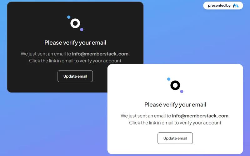
The Email Verification Modal is a stylish and versatile component designed for seamless email verification, available in both dark and light themes. Key Features Responsive design suitable for various devices Customizable themes (dark and light)Includes options to resend verification email or update email address User-friendly interface with clear instructions Integrates easily with existing web applications Design Elements Modern and clean layout Use of contrasting colors for visibility Incorporates icons for enhanced user experience Flexible container sizes for different screen resolutions Potential Use Cases Web applications requiring user email verificationE-commerce platforms needing account confirmation Membership sites for user registration and validation SaaS products that require user authentication Educational platforms for student account management Conclusion: The Email Verification Modal is a versatile and visually appealing component that enhances user experience by simplifying the email verification process, making it an excellent choice for various web applications.

Become an Affiliate
View Component
CTA

Become an Affiliate

Craftwork's affiliate program allows users to earn a 25% commission on every purchase or subscription through easy registration and promotional opportunities. Key Features Simple registration processSupports various marketing strategiesDesign Elements: Modern and clean layout Use of vibrant colors like yellow and black Incorporation of SVG images for clarity Responsive design for mobile and desktop Potential Use Cases: Online marketers looking to monetize their audience Bloggers and content creators promoting products Businesses seeking to expand their sales channels Influencers wanting to earn through affiliate linksE-commerce platforms wanting to incentivize referrals Conclusion: The 'Become an Affiliate' component is a versatile tool for driving sales and engagement, making it ideal for various online marketing strategies.

Mobile First Sign Up
View Component
Regístrese en

Mobile First Sign Up

The Mobile First Sign Up component features an onboarding slider that allows users to choose their signup method without distractions. It is designed to integrate seamlessly with Memberstack and is open-source. Key Features Onboarding slider for user-friendly navigation Integration with Memberstack for membership management Open-source for customization and flexibility Responsive design optimized for mobile devices Design Elements Bright color scheme with a focus on usability Rounded corners and soft shadows for a modern look Social media sign-in options for convenience Clear typography and intuitive layout Potential Use Cases Startups looking to create a user-friendly signup processE-commerce websites needing a streamlined registration form SaaS platforms wanting to enhance user onboarding Educational platforms requiring user account creation Nonprofits seeking to engage users through easy sign-up Conclusion: The Mobile First Sign Up component is a versatile and visually appealing solution for any business looking to simplify the user registration process while ensuring a smooth onboarding experience.

Plan Selection Modal
View Component
AllPricing

Plan Selection Modal

The Plan Selection Modal provides a sleek and user-friendly interface for selecting subscription plans, featuring a modern dark theme that enhances both aesthetics and functionality. Key Features Dark theme design for improved aesthetics Responsive modal for easy plan selection Includes flexible pricing options Supports multiple user plans with clear descriptions Interactive tabs for easy navigation between plans Design Elements Sleek dark color palette Rounded corners and shadow effects for depth Clear typography with varying weights for emphasis Icons accompanying plan descriptions for visual appeal Potential Use Cases SaaS companies looking to showcase subscription optionsE-commerce platforms offering membership plans Online services requiring tiered pricing structures Event registration sites with different ticket types Educational platforms with various course access levels Conclusion: The Plan Selection Modal is a versatile component that enhances user experience by simplifying the decision-making process for potential customers, making it an excellent addition to any website focused on subscriptions or memberships.

Webflow Registro sin contraseña
View Component
PasswordlessSignup

Webflow Registro sin contraseña

The Webflow Passwordless Signup component allows users to create accounts without traditional passwords, enhancing security and user experience. It features a streamlined process for email verification and social login options. Key Features Passwordless signup process using email verification Social login options including Google Responsive design suitable for various devices Customizable form fields and success/error messages User-friendly interface with clear instructions Design Elements Clean and modern layout Centered content with ample white space Use of icons for visual appeal Consistent color scheme with a focus on usability Rounded corners for input fields and buttons Potential Use Cases Startups looking to simplify user registrationE-commerce platforms wanting to reduce cart abandonment SaaS applications aiming for a seamless onboarding experience Blogs or content sites wanting to encourage user signups Mobile applications requiring quick user authentication Conclusion: The Webflow Passwordless Signup component is a versatile solution for businesses seeking to enhance user registration while maintaining security and ease of use.

Hero + Sign Up Form
View Component
Regístrese en

Hero + Sign Up Form

The Hero + Sign Up Form component is designed to enhance user engagement and boost conversions by integrating a signup form directly within the hero section of a website. It provides a seamless way for users to connect instantly. Key Features Integrated signup form in the hero section Responsive design for various devices Customizable layout and styles Includes success and error messages for form submissions Social login options available (Google and Facebook) Design Elements Minimalistic and modern layout Flexible grid structure Use of vibrant colors for buttons and links Clear typography for headings and paragraphs Background image options for visual appeal Potential Use Cases Startups looking to capture leads quicklyE-commerce websites aiming to build customer lists Blogs or content sites wanting to grow their subscriber base Event registration pages that require user signups SaaS platforms needing user account creation Conclusion: The Hero + Sign Up Form component is a versatile tool for any website aiming to improve user engagement and streamline the signup process, making it an excellent choice for various industries.

 Desconectado
View Component
AllLogged Out

Desconectado

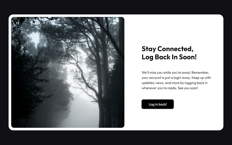
The 'Logged Out' component offers a stylish card design that enhances the logout experience with a classic black and white theme. Key Features Sleek card design for logout confirmation Timeless black and white color scheme Responsive layout suitable for various devices Includes engaging text to encourage users to log back in Customizable styles and animations Design Elements Minimalist aesthetic with a focus on typography Rounded corners for a modern look Use of high-quality images to enhance visual appeal Flexible layout with grid and flexbox properties Potential Use Cases Web applications requiring user authenticationE-commerce sites wanting to improve user experience during logout Blogs or content platforms encouraging user engagement Membership sites needing a professional logout interface Corporate websites aiming for a polished user experience Conclusion: The 'Logged Out' component is a versatile and visually appealing solution for enhancing user experience during the logout process, making it suitable for a wide range of web applications.

2 Tier Neutral Pricing Table
View Component
Precios

2 Tier Neutral Pricing Table

The 2 Tier Neutral Pricing Table is designed to present pricing options clearly and effectively, making it easy for users to compare different plans. It features a clean layout with distinct sections for each pricing tier. Key Features Two pricing tiers Clear pricing display with monthly rates Visual indicators for features included in each plan Responsive design for mobile and desktop views Includes links for further actions like signup Design Elements: Neutral color palette with a focus on readability Rounded corners for a modern look Icons used to represent features visually Flexbox layout for responsive design Potential Use Cases: SaaS companies looking to showcase subscription plansE-commerce platforms needing to display service tiers Consulting firms offering different service packages Educational platforms with tiered membership options Any business needing a clear pricing structure Conclusion: The 2 Tier Neutral Pricing Table is a versatile and visually appealing component that can enhance any website's pricing strategy, making it easier for customers to make informed decisions.

Mesa de precios de 2 niveles estilo Slack
View Component
Precios

Mesa de precios de 2 niveles estilo Slack

This pricing table is inspired by Slack's design, providing a clean and modern layout for showcasing pricing options. Key Features Two-tier pricing structure (monthly and yearly options)Interactive tabs for easy navigation between different pricing plans Clear visual indicators for features included in each plan Responsive design suitable for various devices Design Elements: Minimalistic and modern aesthetic Soft color palette with shades of gray, green and purple Rounded corners and subtle shadows for a card-like appearance Centered headings and clear typography for readability Potential Use Cases: SaaS companies looking to present subscription plans Startups wanting to highlight pricing options for their servicesE-commerce platforms that offer tiered membership or subscription services Consulting firms needing to showcase service packages Educational platforms offering different pricing for courses or memberships Conclusion: The 2 Tier Slack Style Pricing Table is a versatile component that effectively communicates pricing options while maintaining a user-friendly interface, making it an excellent choice for various businesses.

Modal de mejora de 2 niveles
View Component
Pre-built ModalsUpgrade

Modal de mejora de 2 niveles

The 2 Tier Upgrade Modal is designed to prompt users to upgrade their subscription plans with a visually appealing interface. It features a two-tab layout for monthly and annual pricing options. Key Features Two pricing tiers: Monthly and Annual Interactive tabs for easy navigation Customizable modal design Includes icons for visual appeal Responsive design suitable for various devices User-friendly upgrade prompts Design Elements: Modern and clean layout Soft color palette with a transparent background Rounded corners and subtle shadows for depth Clear typography for readabilityicons integrated for enhanced visual communication Potential Use Cases: SaaS companies looking to encourage subscription upgradesE-commerce platforms offering premium memberships Online services with tiered pricing models Mobile applications needing in-app upgrade prompts Websites aiming to enhance user engagement through subscription offers Conclusion: The 2 Tier Upgrade Modal is a versatile and visually appealing component that effectively encourages users to upgrade their plans, making it a valuable addition for any subscription-based service.

Formularios de autorización de 2 pestañas
View Component
SignupLogin

Formularios de autorización de 2 pestañas

The 2-Tab Auth Forms component provides a user-friendly interface for authentication, allowing users to easily switch between 'Sign Up' and 'Log In' forms. It is designed for seamless integration into websites requiring user registration and login functionalities. Key Features Two-tab interface for easy switching between Sign Up and Log In forms Customizable form fields for email and password Google sign-in option for quick access Responsive design suitable for various devices Success and error messages for user feedback Design Elements: Modern and clean layout with a focus on usability Color scheme featuring shades of blue and white Rounded buttons and input fields for a friendly appearance Icons for social sign-in options Potential Use Cases: Web applications requiring user authenticationE-commerce sites needing user accounts for purchases Membership platforms for content access Online services offering personalized user experiences SaaS products that require user login and registration Conclusion: The 2-Tab Auth Forms component is a versatile solution for any website needing authentication features, combining functionality with an appealing design to enhance user experience.

Formulario de perfil de 3 pestañas
View Component
Profile EmailProfile Password+1

Formulario de perfil de 3 pestañas

The 3 Tab Profile Form is a versatile Webflow component designed for user profile management, featuring a tabbed interface for easy navigation between different sections such as general information, email, and password updates. Key Features Tabbed navigation for seamless user experience Form fields for personal information, email, and password Success and error messages for form submissions Image upload functionality for profile pictures Responsive design suitable for various devices Design Elements Modern and clean layout with rounded corners Flexbox for alignment and spacing Color scheme with dark backgrounds and contrasting text Customizable styles for form fields and buttons Potential Use Cases User profile management for social media platforms Account settings for e-commerce websites Profile editing for membership sites Personal information updates for SaaS applications User onboarding processes in web applications Conclusion: The 3 Tab Profile Form is a highly functional and visually appealing component that enhances user interaction, making it ideal for any application requiring user profile management.

Tabla de precios de 3 niveles
View Component
Precios

Tabla de precios de 3 niveles

This cloneable pricing table features a classic 3-tier layout, highlighting the middle plan as the most prominent option. It comes pre-configured with Memberstack attributes and modals for easy integration. Key Features Three distinct pricing tiers Prominent middle plan for better visibility Pre-applied Memberstack attributes and modals Responsive design suitable for various devices Cloneable for easy implementation Design Elements Modern and clean layoutColorful accents with a purple themeRounded corners and shadow effects for depthFlexbox layout for responsive design Potential Use Cases SaaS companies offering subscription plans Freelancers showcasing service packagesE-commerce websites with tiered pricing options Consulting firms presenting service tiers Educational platforms with course pricing Conclusion: The 3 Tier Pricing Table is a versatile and visually appealing component that can enhance any website's pricing strategy, making it easier for users to compare options and make decisions.

Tabla de precios de 3 niveles con palanca
View Component
Precios

Tabla de precios de 3 niveles con palanca

This component features a visually appealing pricing table with a toggle functionality, allowing users to switch between monthly and yearly pricing options seamlessly. Key Features Three-tier pricing structure Toggle switch for monthly/yearly pricing Custom Java Script for enhanced interactivity Responsive design suitable for various devices Includes a navigation bar for easy site navigation Design Elements: Modern and clean layout Color scheme featuring dark backgrounds with contrasting text Use of images for logos and icons Hover effects for interactive elements Potential Use Cases: SaaS companies looking to display subscription plansE-commerce websites offering tiered pricing for services Freelancers or agencies showcasing service packages Educational platforms with different membership levels Non-profits presenting donation tiers Conclusion: The 3 Tier Pricing Table With Toggle is a versatile and stylish component ideal for businesses aiming to present their pricing options clearly and attractively.

3 Tier SaaS Pricing Table
View Component
Precios

3 Tier SaaS Pricing Table

This component showcases a structured pricing table featuring Premium, Pro, and Ultra plans, designed to cater to various customer needs and enhance user experience. Key Features Three distinct pricing plans Customizable features for each plan, including unlimited storage and integrations Responsive design suitable for various devices Includes call-to-action buttons for easy sign-up Design Elements: Modern, clean layout with a grid structureIcons to visually represent featuresHover effects on buttons for enhanced interactivityPotential Use Cases: SaaS companies looking to present pricing options clearly Startups needing a professional pricing display Businesses aiming to compare service tiers effectively Web designers creating landing pages for subscription services Conclusion: The 3 Tier SaaS Pricing Table is a versatile and visually appealing component that effectively communicates pricing options, making it an excellent choice for businesses in the SaaS industry.

Formulario de inscripción 3D
View Component
Regístrese en

Formulario de inscripción 3D

The 3D Signup Form is an interactive and visually appealing component designed to facilitate user registration on websites. It features a modern design with a 3D effect that enhances user engagement. Key Features Responsive design suitable for various devices Includes fields for name, email, and password Option to sign up using Google Success and error messages for user feedback Customizable styles and colors Design Elements 3D visual effectsGradient background imageRounded corners and shadow effectsClear and modern typographyInteractive buttons with hover effects Potential Use Cases Startups looking to create an engaging signup experienceE-commerce websites needing user registration SaaS platforms requiring user account creation Event registration pages for conferences or webinars Educational platforms for student enrollment Conclusion: The 3D Signup Form is a versatile and visually striking component that can significantly enhance user experience and engagement on various types of websites.

4 Tier Lifetime Plan Table
View Component
Precios

4 Tier Lifetime Plan Table

A comprehensive pricing table featuring an email form and four distinct plan options, designed to facilitate user engagement and conversions. Key Features Four different pricing plansIntegrated email subscription formResponsive design for various devicesClear call-to-action buttonsDesign Elements: Colorful backgroundsRounded corners for cardsGrid layout for plan cardsHover effects on buttons and linksPotential Use Cases: SaaS companies offering subscription servicesE-commerce platforms promoting membership plans Online educational platforms with tiered access Fitness or wellness programs with different membership levels Non-profits seeking donations with tiered benefits Conclusion: The 4 Tier Lifetime Plan Table is a versatile and visually appealing component that effectively communicates pricing options while encouraging user interaction, making it suitable for various industries.

Tabla de precios de 4 niveles
View Component
Precios

Tabla de precios de 4 niveles

A versatile 4-tier pricing table designed for use with Memberstack attributes, ideal for showcasing different pricing plans clearly and effectively. Key Features Four distinct pricing tiers Responsive design for various screen sizes Integration with Memberstack for user management Customizable pricing options Includes call-to-action buttons for user engagement Design Elements Clean and modern layout Colorful accents with a blue background Use of icons for visual appeal Clear typography for easy readability Hover effects on buttons for interactivity Potential Use Cases SaaS companies offering tiered subscription plansE-commerce platforms with different pricing levels Service providers like gyms or clubs with membership options Educational platforms with varied course pricing Freelancers or agencies showcasing service packages Conclusion: The 4 Tier Pricing Table is a highly adaptable component that effectively communicates pricing options, making it an excellent choice for a wide range of businesses.

AI Power Boost CTA
View Component
CTA

AI Power Boost CTA

The AI Power Boost CTA is a Webflow component designed to enhance user engagement through a visually striking call-to-action section. It features a bold heading and a compelling message aimed at encouraging users to take action, such as 'Get Started'. This component is suitable for websites focused on technology, innovation, or AI-related services. Key Features Prominent heading with customizable text, e.g., 'Set fire to the AI industry now'.Call-to-action button styled for visibility and interaction, labeled 'Get Started'.Responsive design that adapts to various screen sizes, ensuring accessibility on mobile devices.Incorporates images that can be easily swapped out for branding purposes. Design Elements Bold typography for headings, enhancing readability and impact.A contrasting color scheme that draws attention to the CTA button.Use of images that complement the text, creating a cohesive visual narrative.Flexbox layout for aligning elements centrally, ensuring a balanced appearance. Potential Use Cases Tech startups looking to promote AI solutions.Educational platforms offering courses on artificial intelligence.Consulting firms specializing in digital transformation.Marketing agencies focusing on innovative technology services. Conclusion: The AI Power Boost CTA component is a powerful tool for driving user engagement, making it an excellent choice for businesses aiming to promote their AI-related offerings.

Tabla de precios de productos AI
View Component
Precios

Tabla de precios de productos AI

The AI Product Pricing Table is a visually appealing and functional component designed to display pricing options for AI products. It features a clean layout with interactive tabs for easy navigation between different pricing plans. Key Features Responsive design suitable for various devices Interactive tabs for switching between pricing plans Clear display of features included in each plan Pricing options for monthly and annual subscriptions Visual indicators for discounts on annual plans Design Elements: Modern and clean aesthetic Color scheme featuring shades of purple and grey Use of icons for visual appeal Well-structured layout with ample spacing Potential Use Cases: SaaS companies offering AI-based services Startups launching AI productsE-commerce platforms selling AI tools Consulting firms providing AI solutions Educational platforms offering AI courses Conclusion: The AI Product Pricing Table is a versatile component that enhances user experience by clearly presenting pricing options, making it an excellent choice for businesses in the AI sector.

Página de acceso denegado
View Component
PaywallGated Content

Página de acceso denegado

The Access Denied Page is designed to inform users that they do not have permission to view certain content, encouraging them to upgrade their plan or log in to access restricted areas. Key Features Responsive design suitable for various devices Clear messaging for users about access restrictions Call-to-action buttons for upgrading or logging in Customizable layout and styles Design Elements Clean and modern layout with a white background Use of contrasting colors for text and buttons Incorporation of icons for visual appeal Flexible grid layout for content organization Potential Use Cases Membership websites requiring tiered accessE-commerce platforms with exclusive content Educational sites with course restrictions Corporate intranets for employee access control Conclusion: The Access Denied Page is a versatile component that enhances user experience by clearly communicating access limitations while providing pathways for users to gain access, making it ideal for various online platforms.

Account Creation #7
View Component
Regístrese en

Account Creation #7

This component is designed for user account creation, featuring a clean and modern layout that facilitates easy sign-up through email or social media accounts. Key Features Responsive design suitable for various devices Supports social media sign-up options (Google, Facebook, Linked In)Includes form validation for required fields Customizable success and error messages User-friendly interface with clear instructions Design Elements: Minimalistic style with a focus on usability Color scheme featuring dark backgrounds with white text Use of icons for social media buttons Flexible layout with sections for form fields and social login options Potential Use Cases: Web applications requiring user registrationE-commerce platforms needing customer accounts Social networks or community sites SaaS products offering subscription-based services Event registration sites Conclusion: The Account Creation #7 component is a versatile and visually appealing solution for any website looking to streamline user registration and enhance user experience.

Configuración de la cuenta
View Component
Profile EmailProfile Password+1

Configuración de la cuenta

The Account Settings component allows users to update their profile information, including name, email, and password, through a user-friendly form interface. Key Features User-friendly forms for profile updates Includes fields for first name, last name, phone number, email, and password Success and error messages for form submissions Responsive design suitable for various devices Design Elements: Clean and modern layout with a focus on usability Use of grid and flexbox for responsive design Clear typography for labels and input fields Potential Use Cases: Web applications requiring user profile managementE-commerce platforms for customer account settings Social media sites for user information updates Membership sites for user data management Conclusion: The Account Settings component is versatile and essential for any application that requires user profile management, providing a seamless experience for users to update their information.

Cuadro de mandos contable
View Component
Cuadro de mandos

Cuadro de mandos contable

The Accounting Dashboard is a fully integrated template designed for managing financial data and insights. It features seamless integration with Memberstack, allowing for easy customization and functionality. Key Features Integrated with Memberstack for user management Customizable scripts for tailored functionality Responsive design for various devices Includes various financial metrics and visualizations User-friendly interface for easy navigation Design Elements: Modern and clean layout Color scheme featuring white, green, black and purple Use of icons for intuitive navigation Flexible grid system for content organization Interactive dropdown menus for additional options Potential Use Cases: Small to medium-sized accounting firms Freelancers managing multiple clients Startups needing financial tracking tools Businesses looking for a customizable dashboard solution Educational institutions teaching finance and accounting Conclusion: The Accounting Dashboard template is a versatile and powerful tool for anyone looking to manage financial data effectively, combining aesthetic appeal with practical functionality.

Action Prompt
View Component
AllCTA

Action Prompt

The Action Prompt is a professional, business-focused UI component designed to highlight company activities and achievements while encouraging user engagement through clear call-to-action buttons. Key Features Professional design tailored for business use Clear call-to-action buttons for user engagement Highlights company activities and achievements Encourages contact and consultation bookings Responsive layout suitable for various devices Design Elements Modern and clean UIUse of images and icons to enhance visual appeal Color scheme focused on professionalism (e.g., blue tones)Flexible grid layout for content organization Potential Use Cases Corporate websites looking to improve user engagement Consulting firms wanting to showcase their services and achievements Marketing agencies aiming to attract potential clients Event management companies promoting their events and bookings Startups needing a professional online presence Conclusion: The Action Prompt is a versatile and visually appealing component that effectively drives user interaction, making it an excellent choice for various business applications.

AeroKit UI Access Denied01 Dual Pane
View Component
Contenido cerrado

AeroKit UI Access Denied01 Dual Pane

The AeroKit UI Access Denied01 Dual Pane component is designed to inform users that access to certain content is restricted. It features a dual-pane layout that effectively communicates the access denial message along with options for users to log in or sign up. This component is a free resource for Webflow developers to use in their projects. Key Features Dual-pane layout that separates the access denial message from action buttons.Customizable text elements to convey specific messages, such as 'Access Denied' and 'Access restricted to members only.'Includes buttons for user actions like 'Log in' and 'Create new account.'Responsive design with CSS classes for various screen sizes.Utilizes HTML embedding for custom styles and scripts. Design Elements Clean and modern layout with a focus on user interaction.Use of flexbox for alignment and spacing of elements.Incorporates a light color scheme with white backgrounds and subtle shadows.Typography is set to Manrope, providing a contemporary look.Includes icons for visual enhancement of buttons. Potential Use Cases Membership-based websites that require user authentication.E-commerce platforms where certain products or features are restricted to logged-in users.Online communities that need to manage access to exclusive content.Educational platforms that restrict course materials to enrolled students.Job portals that require users to log in to view job postings. Conclusion: The AeroKit UI Access Denied01 Dual Pane component is a practical solution for managing user access on websites, making it suitable for various industries that require user authentication.

AeroKit UI Access Denied02 Full Screen
View Component
Contenido cerrado

AeroKit UI Access Denied02 Full Screen

The AeroKit UI Access Denied02 Full Screen component is designed to display an access denied message in a visually engaging manner. It features a prominent message indicating that the user does not have permission to view the content, along with a call-to-action button to log in. This component is suitable for applications requiring user authentication. Key Features Full-screen layout with a centered message and button.Customizable text for access denial and instructions.Responsive design that adapts to various screen sizes.Includes CSS for improved text legibility and focus states. Design Elements Background gradient with a subtle overlay for depth.Bold typography for the access denied message, enhancing visibility.Use of flexbox for centering content both vertically and horizontally.Color scheme featuring dark text on a light background for contrast. Potential Use Cases Web applications requiring user authentication.Membership sites that restrict content access.E-commerce platforms with user-specific content.Corporate intranets with restricted access areas. Conclusion: The AeroKit UI Access Denied02 Full Screen component effectively communicates access restrictions while providing a clear path for users to regain access, making it a valuable addition for any web application that requires user authentication.

AeroKit UI CTA02 Dual Pane
View Component
CTA

AeroKit UI CTA02 Dual Pane

The AeroKit UI CTA02 Dual Pane is a Webflow component designed to create engaging call-to-action sections. It features a dual-pane layout that effectively showcases content alongside visual elements, making it suitable for various marketing and promotional purposes. Key Features Dual-pane layout for side-by-side content presentation.Customizable call-to-action button with hover effects.Responsive design that adapts to different screen sizes.Grid layout for displaying multiple images or content blocks.Integrated styling for typography and spacing. Design Elements Utilizes a clean and structured layout with a focus on user engagement.Incorporates a color scheme with dark backgrounds and contrasting text for visibility.Features a grid system to organize images and text effectively.Includes hover effects on buttons to enhance interactivity.Employs a modern typography style with varying font sizes for emphasis. Potential Use Cases Landing pages for product launches or promotions.Service pages for businesses looking to highlight offerings.Event registration pages to encourage sign-ups.Portfolio showcases for creative professionals.Marketing campaigns aimed at driving user engagement. Conclusion: The AeroKit UI CTA02 Dual Pane component is a versatile tool for creating impactful call-to-action sections, making it a valuable addition for Webflow developers looking to enhance user interaction on their websites.

AeroKit UI CTA04 Infinity
View Component
CTA

AeroKit UI CTA04 Infinity

AeroKit UI CTA04 Infinity is a Webflow component designed to create engaging call-to-action sections for websites. It features a visually appealing layout with text and image elements, making it suitable for prompting user interaction. The component includes placeholder text that can be customized to fit various branding needs. Key Features Includes a prominent call-to-action button with customizable text, e.g., 'Get started'.Supports rich text elements for flexible content display, allowing for detailed descriptions.Incorporates responsive design elements to ensure usability across devices.Features image placeholders that can be replaced with relevant graphics.Utilizes CSS for enhanced typography and layout control, ensuring legibility and aesthetic appeal. Design Elements Utilizes a clean layout with a focus on central alignment for content.Incorporates a color scheme that can be customized to match branding.Includes visual elements such as images and buttons that draw attention.Employs a structured hierarchy of text to guide user focus effectively. Potential Use Cases Landing pages for marketing campaigns seeking to convert visitors.Product promotion sections on e-commerce websites.Service offering highlights for consulting or agency websites.Event registration prompts for webinars or conferences.Newsletter sign-up sections for blogs or content-driven sites. Conclusion: The AeroKit UI CTA04 Infinity component is a practical solution for developers looking to enhance user engagement through well-designed call-to-action sections.

AeroKit UI CTA05 Eclipse
View Component
CTA

AeroKit UI CTA05 Eclipse

AeroKit UI CTA05 Eclipse is a call-to-action component designed for Webflow developers. It features a visually engaging layout that encourages user interaction, making it suitable for various applications such as subscription forms or promotional offers. Key Features Includes a responsive form for email collection with placeholders and validation.Utilizes a visually appealing design with images and text to capture attention.Incorporates success and error messages for user feedback after form submission.Supports multiple text styles and sizes for customization. Design Elements Flexbox layout for easy alignment and distribution of elements.A color scheme that combines dark and light elements for contrast.Rounded corners and shadow effects to create depth in the design.Use of large typography for titles to enhance visibility. Potential Use Cases Startups looking to capture leads through email subscriptions.Marketing campaigns that require user engagement through forms.Websites needing a prominent call-to-action section for promotions.Blogs or content sites aiming to grow their subscriber base. Conclusion: The AeroKit UI CTA05 Eclipse component is a functional and visually engaging tool for developers seeking to enhance user interaction on their websites.

AeroKit UI CTA06 Leaf Shape
View Component
CTA

AeroKit UI CTA06 Leaf Shape

The AeroKit UI CTA06 Leaf Shape is a customizable call-to-action component designed for Webflow projects. It features a visually engaging layout that encourages user interaction, making it suitable for various applications such as subscription forms and promotional offers. Key Features Responsive design with flexible layout options for different screen sizes.Includes a form for user input, specifically an email subscription form.Customizable text elements for tailored messaging, such as 'Join 4,000+ thriving startups growing with Untitled.'Incorporates visual elements like images and styled buttons to enhance user engagement.Success and error messages for form submissions to improve user experience. Design Elements Utilizes a leaf shape design motif that adds a unique visual flair.Color scheme primarily features dark backgrounds with white text for contrast.Includes rounded corners and shadow effects for a modern aesthetic.Employs a grid layout for organized content presentation, ensuring clarity and ease of navigation. Potential Use Cases Startups looking to capture leads through email subscriptions.E-commerce websites aiming to promote special offers or discounts.Blogs or content platforms wanting to encourage newsletter sign-ups.Event pages that require user registration or RSVP functionalities.Educational platforms offering updates on courses or new content. Conclusion: The AeroKit UI CTA06 Leaf Shape component is a versatile tool for enhancing user interaction on websites, making it ideal for various industries seeking to improve engagement and conversion rates.

AeroKit UI Faq01 Info Grid
View Component
Marketing UI

AeroKit UI Faq01 Info Grid

The AeroKit UI Faq01 Info Grid is designed to present frequently asked questions in a structured and visually appealing format. It includes sections for questions and answers, making it suitable for enhancing user experience on websites that require clear communication of information. Key Features Grid layout for organizing FAQ items, allowing for a clean and structured presentation.Customizable styles for headings and paragraphs to match branding.Responsive design that adapts to various screen sizes, ensuring accessibility on mobile devices.CSS classes for hover effects on buttons and interactive elements, enhancing user engagement.Includes a link for users to get in touch for further assistance. Design Elements Grid-based layout with defined gaps between items for clarity.Use of flexbox for alignment and spacing, ensuring items are well-positioned.Soft color palette with shades of blue and white, providing a professional look.Hover effects on buttons that change background color and text color for interactivity.Typography choices that enhance readability and visual hierarchy. Potential Use Cases E-commerce websites needing to address customer inquiries about products.Service-based businesses providing information on pricing and plans.Educational institutions offering FAQs about courses and admissions.Job portals clarifying subscription plans and features.Healthcare providers explaining services and patient inquiries. Conclusion: The AeroKit UI Faq01 Info Grid is a practical component for any website looking to improve user interaction through clear and organized FAQ sections.

AeroKit UI Faq02 Toggle
View Component
Marketing UI

AeroKit UI Faq02 Toggle

The AeroKit UI Faq02 Toggle is a user interface component designed for displaying frequently asked questions (FAQs) in a toggle format. It allows users to expand and collapse answers to questions, enhancing user interaction. This component is particularly useful for websites that need to present information in a concise and organized manner. Key Features Toggle functionality for expanding and collapsing answers to FAQs.Customizable styles for headings and paragraphs.Responsive design that adapts to different screen sizes.Focus state styles for accessibility, ensuring keyboard navigation is clear.CSS classes for managing spacing and alignment. Design Elements Utilizes a clean layout with clear headings for questions.Incorporates icons to indicate expandable sections.Employs a color scheme that enhances readability and user engagement.Includes responsive design elements to ensure usability on mobile devices. Potential Use Cases Customer support pages for businesses needing to address common inquiries.Educational websites providing information on courses or programs.E-commerce sites offering product FAQs to assist customers.Service-based websites that require a clear presentation of service-related questions. Conclusion: The AeroKit UI Faq02 Toggle is a practical component for any website looking to enhance user experience by providing easily accessible information through a well-structured FAQ section.

AeroKit UI Faq03 Minimal
View Component
Marketing UI

AeroKit UI Faq03 Minimal

AeroKit UI Faq03 Minimal is a user-friendly FAQ component designed for Webflow projects. It provides a structured layout for frequently asked questions, allowing users to easily navigate and find answers. The component features a clean design with collapsible sections for each question, making it ideal for enhancing user experience on websites. Key Features Collapsible FAQ sections for better organization of content.Customizable styles for headings and paragraphs, allowing for easy integration into various designs.Responsive design that adapts to different screen sizes, ensuring accessibility on mobile devices.Includes CSS for text clarity and focus states, improving usability for keyboard navigation. Design Elements Minimalist layout with a focus on clarity and readability.Use of flexbox for layout management, allowing for a flexible arrangement of FAQ items.Color scheme featuring shades of blue and gray for a professional appearance.Incorporation of whitespace to enhance content separation and visual appeal. Potential Use Cases Corporate websites needing a dedicated FAQ section for customer inquiries.E-commerce platforms looking to provide product-related questions and answers.Service-based businesses wanting to address common client questions.Educational institutions providing information about courses and admissions. Conclusion: The AeroKit UI Faq03 Minimal component is a practical solution for any website requiring an organized FAQ section, enhancing user engagement and information accessibility.

AeroKit UI Feature02 Icon card
View Component
CTA

AeroKit UI Feature02 Icon card

The AeroKit UI Feature02 Icon card is designed to showcase various features and benefits in a visually appealing card format. It includes sections for headings, descriptions, and images, making it suitable for presenting information in a structured manner. For example, it highlights benefits with headings like 'Aerokit Benefits: Why Choose Us?' and includes call-to-action buttons. Key Features Flexible grid layout for content organization, allowing for responsive design.Includes sections for images, headings, and descriptive text to convey information effectively.Call-to-action buttons for user engagement, such as 'View More'.Customizable styles for different screen sizes, ensuring adaptability. Design Elements Dark background with contrasting white text for readability.Grid-based layout that allows for organized presentation of content.Use of images alongside text to enhance visual interest and engagement.Rounded corners and subtle borders for a modern card appearance. Potential Use Cases Tech companies showcasing product features.Service providers highlighting benefits to potential clients.Educational platforms presenting course features.E-commerce websites displaying product advantages.Portfolio sites for freelancers to outline services offered. Conclusion: The AeroKit UI Feature02 Icon card is a versatile component that effectively presents information in a structured and visually engaging manner, making it suitable for various applications across different industries.

AeroKit UI Feature03 Symmetric
View Component
Marketing UI

AeroKit UI Feature03 Symmetric

AeroKit UI Feature03 Symmetric is a Webflow component designed to enhance job posting functionalities on websites. It provides a structured layout for displaying job listings, features, and employer branding options, making it suitable for recruitment platforms and job boards. Key Features Promoted job postings to enhance visibility and attract talent.Employers can create and publish detailed job descriptions.Tools for managing applications and tracking candidates.Integration with HR tools for performance insights.Advanced filters for candidates based on skills and experience. Design Elements Symmetric layout that organizes job listings and features in a visually balanced manner.Use of images and icons to represent job-related functionalities, such as tracking and integration.Typography styles that emphasize headings and important information, enhancing readability. Potential Use Cases Job boards looking to improve user engagement and job visibility.Recruitment agencies that need a structured way to present job listings.Companies wanting to enhance their career pages with detailed job descriptions and branding.Platforms that require integration with HR tools for better candidate management. Conclusion: The AeroKit UI Feature03 Symmetric component is a practical solution for enhancing job posting functionalities, making it a valuable asset for various recruitment-related applications.

AeroKit UI Feature04 Blocks
View Component
CTA

AeroKit UI Feature04 Blocks

AeroKit UI Feature04 Blocks is a Webflow component designed to enhance user interfaces with structured blocks that can be easily customized. This component includes various blocks for displaying content, images, and links, making it suitable for a range of applications. For example, it features sections for job postings, career advice, and interview scheduling. Key Features Multiple block types including headings, paragraphs, images, and links for versatile content display.Customizable styles with CSS for text and layout adjustments, such as margin and padding settings.Responsive design elements that adapt to different screen sizes, ensuring accessibility on mobile devices.Focus state styles for improved accessibility during keyboard navigation. Design Elements Utilizes a clean block layout that organizes content effectively.Incorporates a color scheme that emphasizes readability and user engagement.Includes image placeholders that can be replaced with relevant visuals to enhance the overall design. Potential Use Cases Job boards or recruitment websites looking to display job postings and career resources.Corporate websites that require sections for employee resources and career advice.Educational platforms providing interview preparation and resume tips.Freelance or consulting services showcasing their offerings and client testimonials. Conclusion: AeroKit UI Feature04 Blocks offers a flexible and structured approach to content presentation, making it a valuable asset for various web projects.

AeroKit UI Feature05 Highlights
View Component
CTA

AeroKit UI Feature05 Highlights

AeroKit UI Feature05 Highlights is a Webflow component designed to showcase job opportunities and features in a visually engaging manner. It utilizes a structured layout with images and text to convey information effectively, making it suitable for job boards or career-related websites. Key Features Responsive design with flexbox layout for optimal viewing on various devices.Custom CSS styles for typography and spacing, enhancing readability and visual hierarchy.Image embedding capabilities to display relevant visuals alongside text content.Interactive elements such as links to encourage user engagement. Design Elements A gradient background that transitions from soft colors, creating a visually appealing section.Use of flexbox for layout, allowing for a clean and organized presentation of features.Typography styles that emphasize headings and important text, ensuring clarity.Incorporation of icons and images to complement textual information and enhance user experience. Potential Use Cases Job boards looking to highlight various job opportunities.Career counseling websites aiming to provide insights into job specialization.Recruitment agencies wanting to present job listings attractively.Educational platforms that offer career advice and job placement services. Conclusion: The AeroKit UI Feature05 Highlights component is a practical solution for businesses and platforms focused on job opportunities, providing a visually structured way to present information and engage users.

AeroKit UI Feature06 Light
View Component
Marketing UI

AeroKit UI Feature06 Light

AeroKit UI Feature06 Light is a Webflow component designed to showcase various career paths in tech and business. It features a clean layout with sections for images and text, making it suitable for displaying information about different roles such as UI/UX Designer, Software Engineer, and Business Analyst. Key Features Responsive design with flexbox layout for easy alignment and spacing.Custom CSS styles for typography and color management, ensuring readability.Image placeholders for visual representation of each career role.Text clamping for concise descriptions, enhancing user experience. Design Elements Flexbox layout for a structured presentation of content.Use of SVG images for icons, ensuring scalability and clarity.Color scheme based on hsla values for a modern aesthetic.Typography styles that prioritize legibility and hierarchy. Potential Use Cases Career websites looking to highlight various job roles.Educational platforms offering courses in tech and business.Recruitment agencies showcasing job opportunities.Company websites promoting their team and roles. Conclusion: AeroKit UI Feature06 Light is a versatile component that effectively presents career information, making it a valuable resource for various industries focused on tech and business.

AeroKit UI Feature07 Icon Grid
View Component
Marketing UI

AeroKit UI Feature07 Icon Grid

The AeroKit UI Feature07 Icon Grid is a Webflow component designed to showcase various categories with icons and descriptions. It features a grid layout that allows for easy navigation and exploration of different categories, making it suitable for websites that require a structured presentation of services or products. Key Features Grid layout for displaying icons and descriptions, enhancing visual organization.Includes headings and paragraphs for category titles and descriptions, such as 'Explore by Category' and 'Nisl urna scelerisque id vel vitae at a mi nibh platea in.'Interactive links for each category, allowing users to navigate to more detailed pages.Responsive design elements that adapt to different screen sizes, ensuring usability across devices. Design Elements A clean and structured grid layout that emphasizes clarity and organization.Use of soft background colors like #f0eaff and #ffecd2 to create a visually appealing contrast.Icons representing different categories, enhancing user engagement and visual interest.Typography choices that include bold headings and legible body text, ensuring readability. Potential Use Cases E-commerce websites showcasing different product categories.Portfolio sites for creative professionals to display their services.Corporate websites that need to present various departments or offerings.Educational platforms organizing courses or subjects by categories. Conclusion: The AeroKit UI Feature07 Icon Grid is a practical component for developers looking to implement a visually organized and user-friendly interface for category exploration.

...

Showing 1–60 of 807 components

No website yet? Check out our free & paid pre-built template websites!

View templates